DQA dashboard designs
Dashboard designs: Can we create a tool to assess data quality of many datasets within a unified framework?
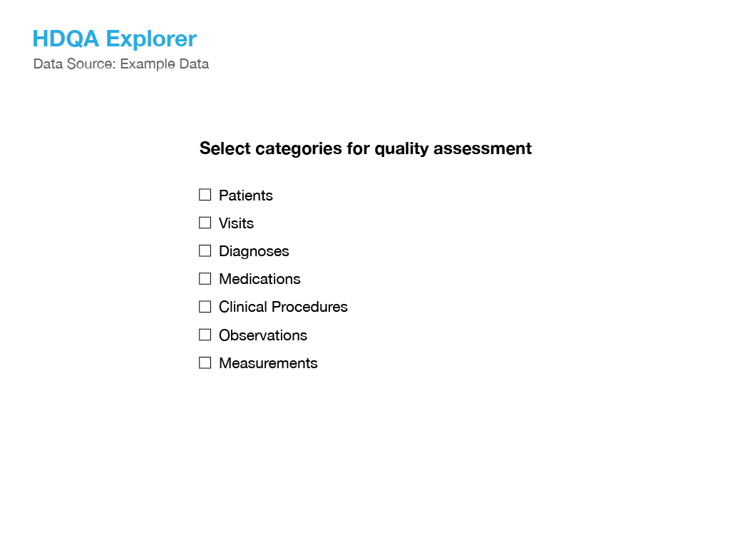
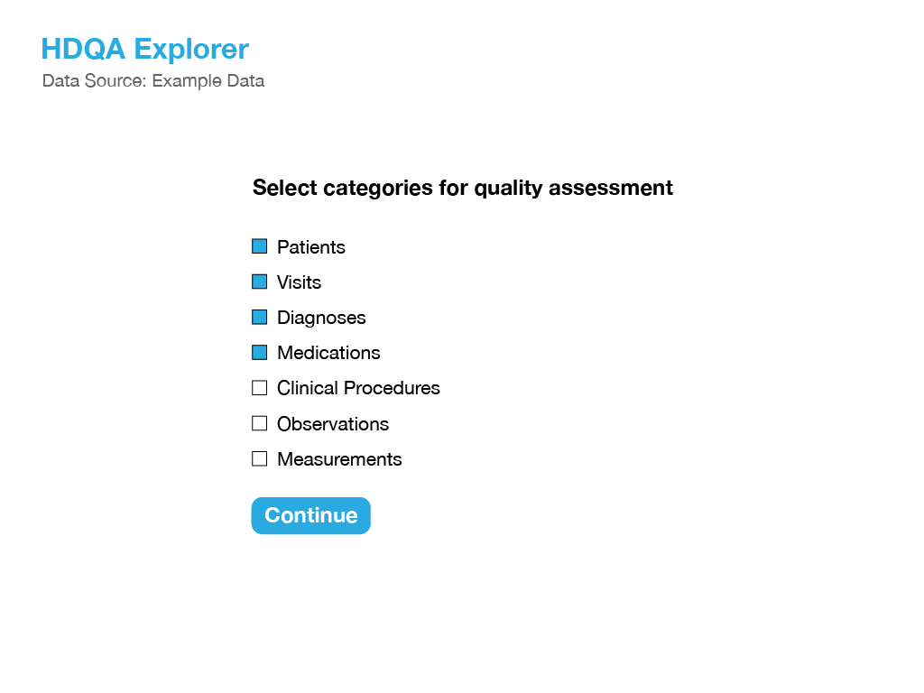
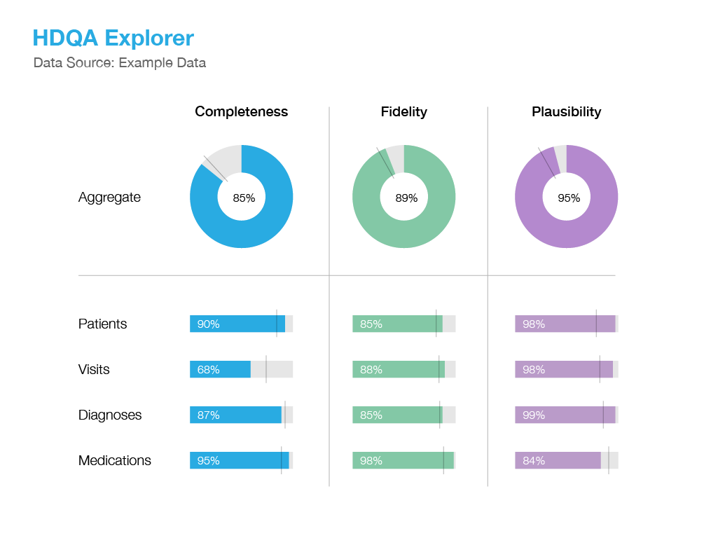
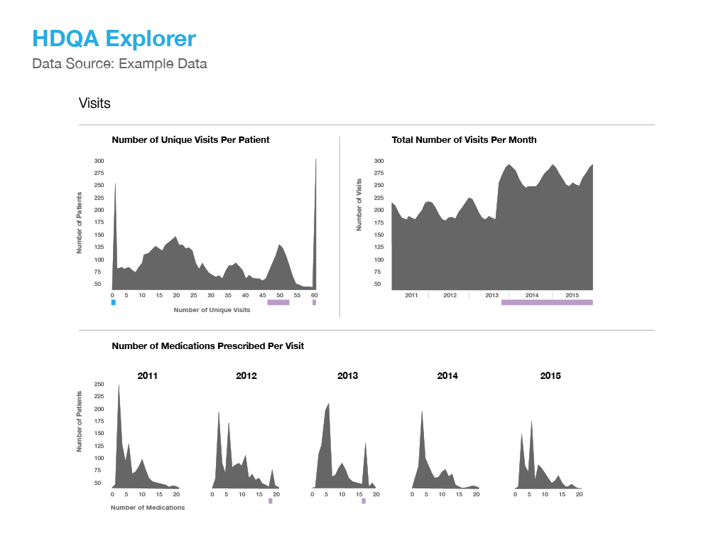
Dashboard mockup: Travis
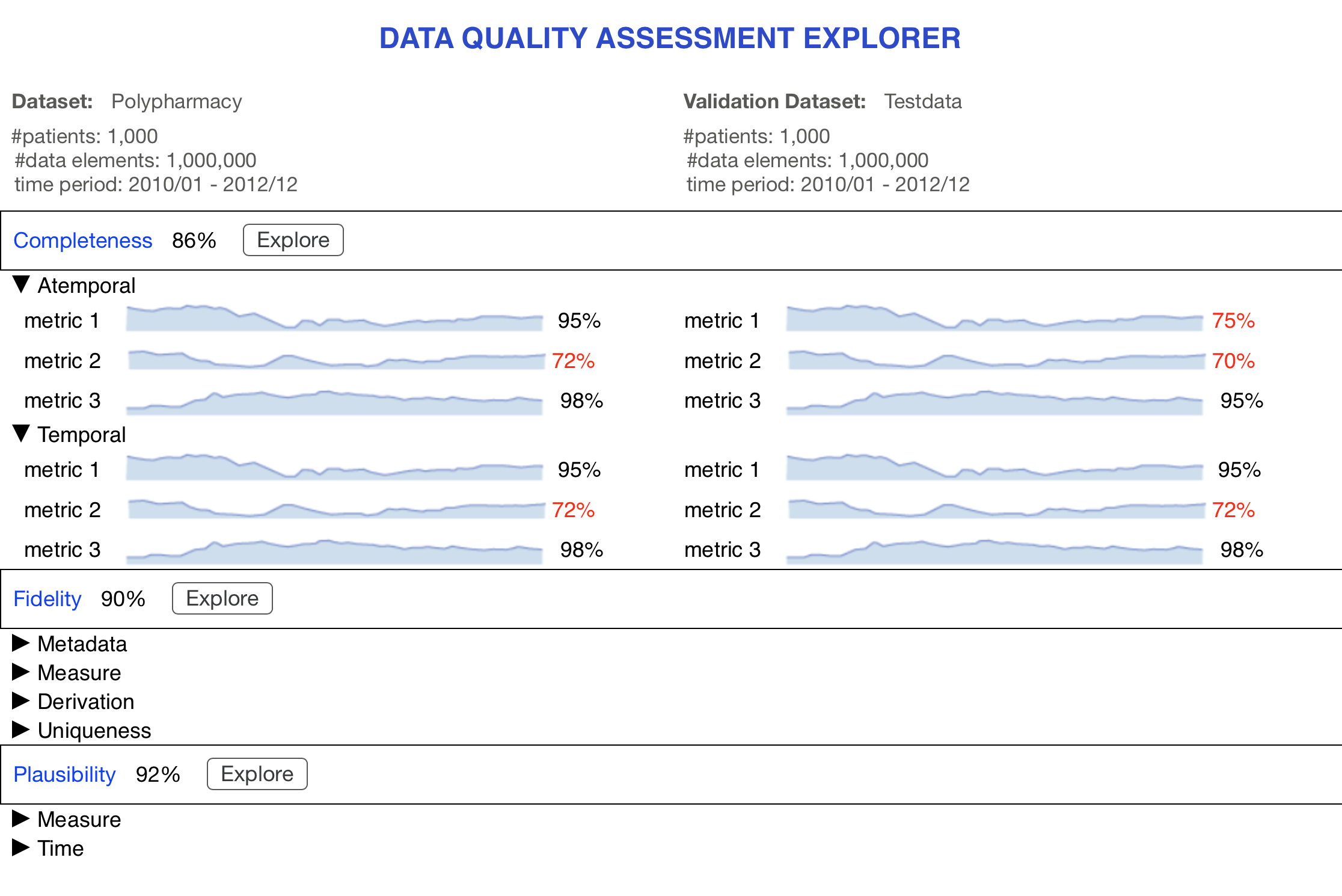
Allows the user to load in a dataset and select specific categories within the data which need to be examined for data quality. The explorer provides a visual dashboard with overview gauging of the data quality specific to Completeness, Fidelity and Plausibility. The user can drill-down into areas by clicking on a sub-item such as Visits and gain more insight via visualizations designed to pinpoint areas of potential data quality within that category.
Click here for interactive dashboard
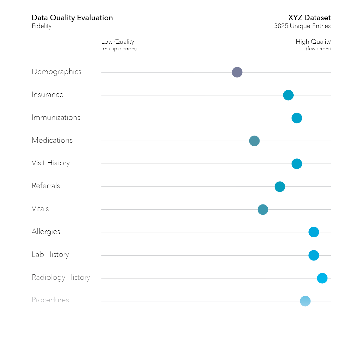
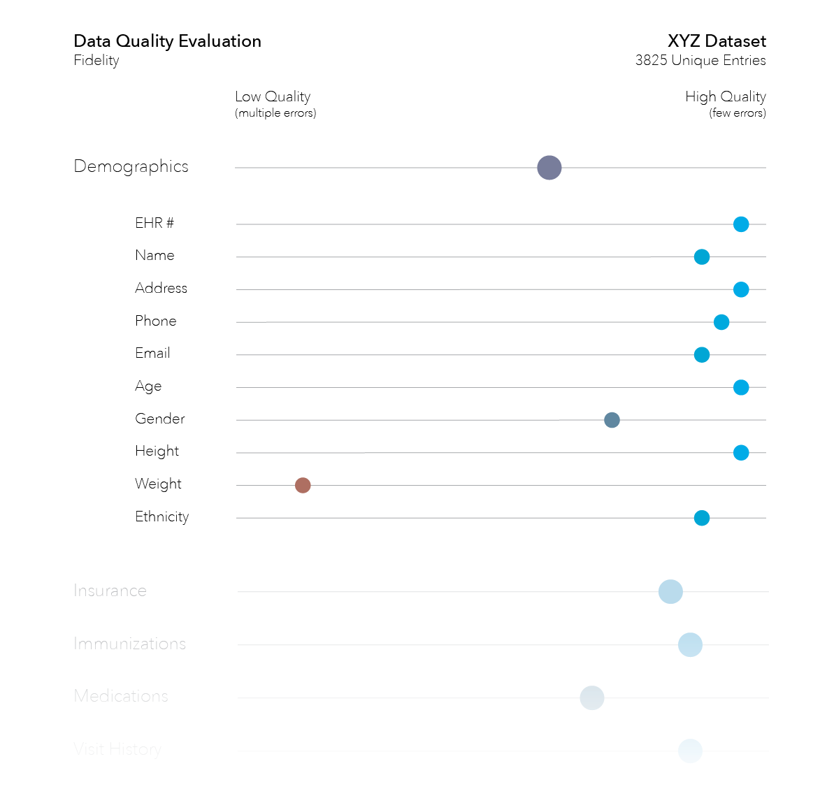
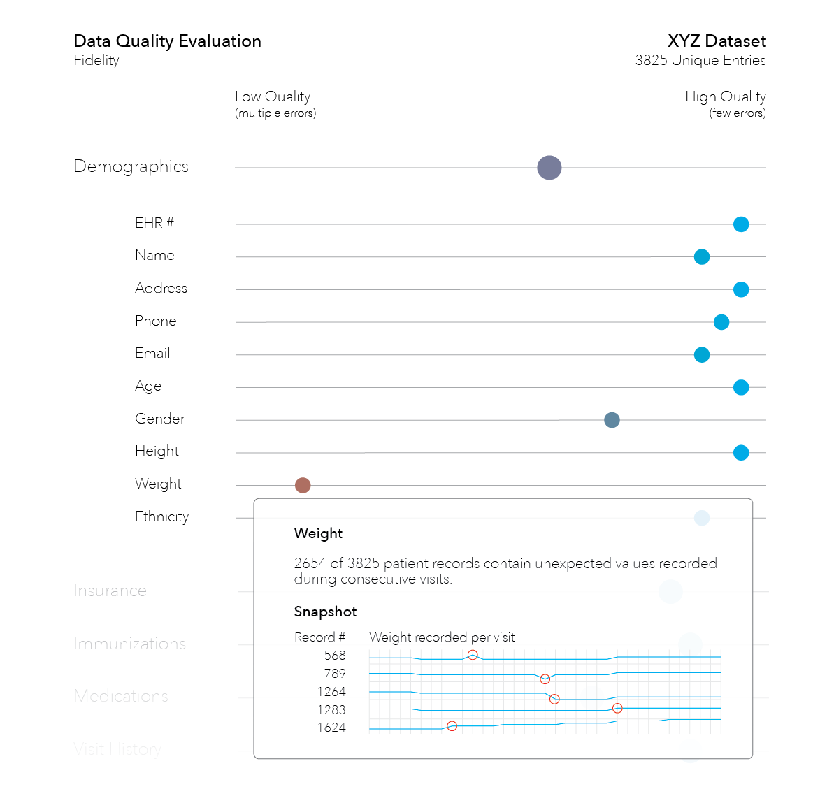
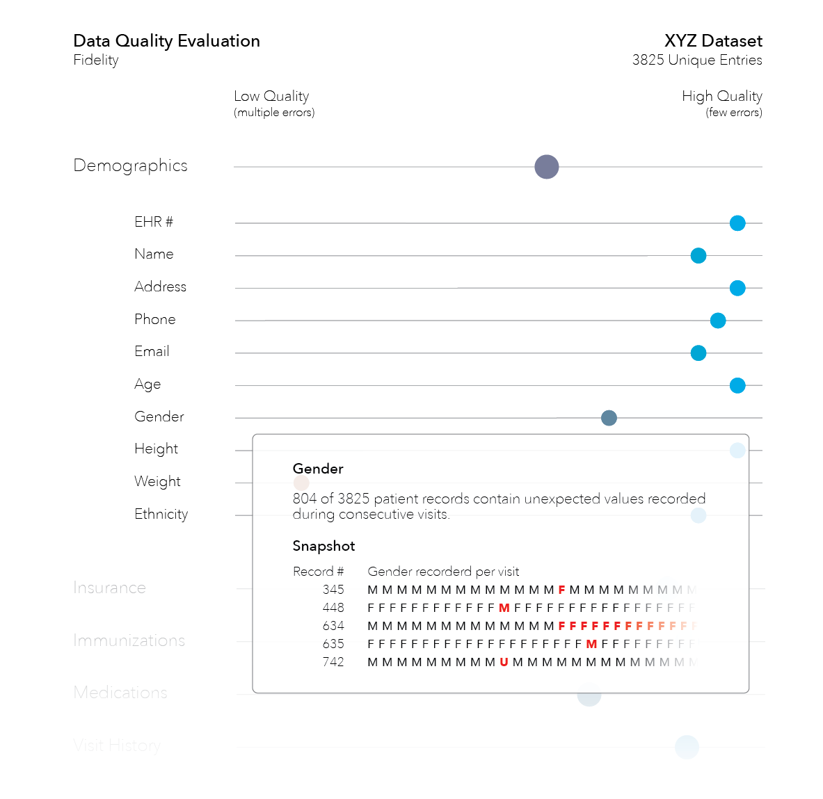
Another design: Travis
In this scenario, the user has loaded in a data set and the tool is providing an overview of the data quality - specifically related to fidelity. Position of the circle along the plot line indicates overall quality of the high level category, Demographics for instance. Color also plays a role with lower quality items toward the red spectrum and higher quality toward the blue. In this example, a drill-down in the Demographics category shows further analysis of items within including visualizations for weight and gender.
Click here for interactive dashboard
Dashboard mockup: Carsten
A different approach to a dashboard created with the Antetype application.